


In today’s digital era, having a website has become a necessity for businesses of all sizes. A website serves as a virtual storefront that allows customers to learn more about your products and services. However, with the rise of mobile devices, it is essential for businesses to ensure that their website is accessible and user-friendly on all screen sizes. This is where responsive screen designs come in.
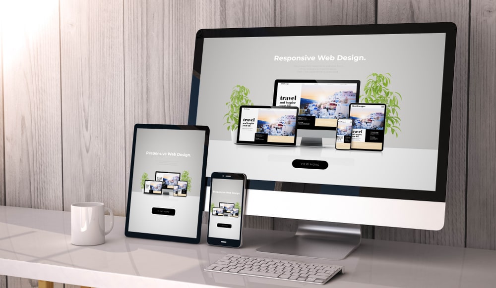
What is Responsive Design?
Responsive design is an approach to web design that aims to provide an optimal user experience on all devices. In simpler terms, it ensures that your website looks and functions well on desktops, laptops, tablets, and smartphones. It involves designing and developing a website in a way that it adjusts its layout and content to fit the screen size of the device that it is being viewed on.
Why is Responsive Design Important?
- Mobile-First Indexing Google introduced mobile-first indexing in 2018, which means that the search engine now primarily uses the mobile version of a website for indexing and ranking. This means that if your website is not mobile-friendly, it may not rank well on search engine result pages (SERPs), resulting in a significant loss of traffic.
- User Experience A responsive design provides a seamless and consistent user experience across all devices. When a website is not optimized for mobile devices, users are likely to encounter problems like slow loading times, distorted images, and non-responsive buttons. This can frustrate users and cause them to leave your website, resulting in lost business.
- Improved Conversion Rates A website that is optimized for mobile devices is more likely to convert visitors into customers. If a website is not responsive, it can lead to a poor user experience, resulting in a high bounce rate and low conversion rates. On the other hand, a responsive website provides users with a seamless experience, making it more likely for them to engage with your content and convert into customers.
- Cost-Effective Maintaining separate websites for desktop and mobile devices can be costly and time-consuming. With a responsive design, you can have a single website that works well on all devices, saving you time and money.
- Future-Proofing With the rise of new devices and screen sizes, having a responsive design ensures that your website is future-proofed. A responsive design can adapt to new screen sizes, resolutions, and technologies, making it a smart investment for the future.
How to Implement Responsive Design
- Mobile-First Approach A mobile-first approach involves designing a website for mobile devices first and then scaling up for larger screens. This approach ensures that the website is optimized for smaller screens and provides a seamless user experience across all devices.
- Flexible Layouts A flexible layout allows a website to adjust its content and layout to fit any screen size. This involves using flexible grids, images, and typography that can adapt to different screen sizes.
- Responsive Images Images play a significant role in web design, and it’s essential to optimize them for different screen sizes. Responsive images ensure that images are scaled and optimized for each device, resulting in faster loading times and a better user experience.
- Media Queries Media queries allow you to specify different styles for different devices. This means that you can adjust the layout, font size, and other elements based on the screen size of the device.
- Testing and Optimization Testing and optimizing your website on different devices is crucial to ensure that it works well on all devices. You can use tools like Google’s Mobile-Friendly Test and BrowserStack to test your website on different devices and browsers.